Designing a company store that drives real engagement requires strategy first, aesthetics second. This guide covers the specific design decisions — from brand alignment to product curation to fulfillment planning — that separate stores people use from stores that collect digital dust.
Key Takeaways
- Start with brand strategy: define your store's purpose and primary audience before selecting products
- Apply brand guidelines consistently — logo rules, Pantone colors, approved typography — across every store element
- Curate fewer, better products organized by use case
- Design for your audience segments — navigation and fulfillment decisions are strategy, not afterthoughts
Start with Brand Strategy Before Building Anything
The most common reason a company store underperforms isn't a bad product selection — it's a missing strategy. Without a clear purpose, every design decision becomes a guess.
Define the Store's Purpose First
Before touching layout or product catalogs, answer one question: what is this store actually for?
The four most common use cases each carry different design implications:
- Employee recognition and milestones — requires premium quality, tiered access, and a curated product mix that feels like a reward
- New hire onboarding — needs a consistent kit experience, clear navigation, and items employees will actually use day one
- Customer-facing brand promotion — prioritizes brand visibility, product quality as a brand signal, and a clean, on-brand storefront experience
- Event and field distribution — demands speed, practical items, and fulfillment reliability above all else
A store trying to serve all four without differentiation typically serves none of them well.
The 7 Brand Strategy Elements Applied to Store Design
The seven elements of brand strategy — purpose, consistency, emotion, flexibility, employee involvement, loyalty, and competitive awareness — aren't abstract marketing concepts. Each one maps directly to a design decision:
| Brand Element | Store Design Application |
|---|---|
| Purpose | Defines the store's primary use case and audience |
| Consistency | Governs logo rules, color standards, and product quality thresholds |
| Emotion | Informs product selection — what will recipients actually value? |
| Flexibility | Determines whether you need category variants for different teams |
| Employee involvement | Shapes the recognition and onboarding product tiers |
| Loyalty | Guides premium gifting strategy for long-term customers |
| Competitive awareness | Sets quality and presentation standards vs. what competitors give |
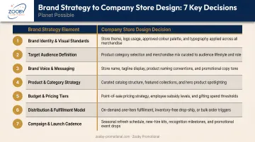
Mapping these elements early makes every subsequent design decision easier — and more defensible when stakeholders push back.
Internal vs. External Audiences
Stores serving employees (HR onboarding, sales teams, remote staff) have different design priorities than stores facing customers or event attendees. Internal stores can lean into utility and team culture. External stores carry the full weight of brand impression.
That distinction matters more than most companies expect. Research from PPAI found that 61% of consumers clearly remember the brand behind their last promotional item — which means every product an external store ships is a brand touchpoint, not just merchandise.
Skipping strategy shows up fast: inconsistent products, off-brand visuals, and stores that nobody uses. Zooby Promotional offers free company stores specifically so companies aren't forced to cut corners during setup — you can take the time to get the strategy right before anything goes live.
Translate Brand Identity into Every Store Design Element
Brand guidelines define how your organization looks, sounds, and feels — and they apply to your company store just as rigorously as any marketing campaign. Every design choice in your store, digital or physical, either reinforces that identity or quietly erodes it.
Apply Guidelines Consistently Across Every Element
When brand identity is applied well, the online storefront and the physical products feel like they came from the same place. When it breaks down, you get mismatched hex codes, outdated logo versions, or fonts that clash with the brand's established visual language.
Every store design element needs a mapped brand standard:
- Logo usage: which version, minimum size, clear space rules, and prohibited applications
- Color palette: exact hex codes for digital surfaces, Pantone (PMS) codes for physical product imprinting
- Typography: approved fonts for product names, category headers, and descriptions
- Tone of voice: product copy should sound like the brand, not like generic catalog descriptions
- Photography style: product images should match the aesthetic standards in your broader marketing
Color Consistency: Digital and Physical
This is where most stores develop invisible inconsistencies. A brand's blue looks correct on the website but prints slightly off on drinkware. PPAI's graphics guidance stresses using Pantone spot colors and vector artwork for one- and two-color imprints — particularly on items like pens, cups, and bags where color accuracy is immediately visible.
The fix: require Pantone (PMS) color specs alongside hex codes in your brand standards, and confirm that your store's product pages reflect those specs before items go live.
Logo Placement Strategy
Once color accuracy is locked down, placement becomes the next critical decision — and the right choice depends on how the item will actually be used. Consider:
- Prominent, high-visibility placement works for outerwear, bags, and event gear — items where brand exposure is the point
- Subtle or tonal branding fits professional apparel and lifestyle accessories — where oversized logos reduce how often people wear the item
A polo with a clean, chest-sized logo gets worn to client meetings. The same shirt with a massive back print stays in the closet. Appropriate placement is what turns merchandise into long-term brand exposure.
Brand the Storefront, Not Just the Products
The store itself is a brand experience. The URL, header design, banner imagery, product photography style, and even category naming conventions should all feel like extensions of your visual identity — not a generic e-commerce template with your logo pasted over it. A Lucidpress/Marq study found consistent branding is associated with a 10–20% revenue lift, with 77% of companies reporting they struggle with off-brand content. Your store is a key place to close that gap.
Curate Products That Reinforce Your Brand Story
A company store with 200 mediocre items says less about your brand than one with 30 carefully chosen products. Curation is a brand decision.
The Four Merchandise Types
Each type serves a different function in your store:
- Promotional/marketing items: pens, totes, lanyards — high-volume, broad-reach items built for visibility
- Wearables and apparel: your brand's most visible walking advertisement; quality here shapes perception directly
- Functional/utility products: drinkware, tech accessories, desk items — chosen because people actually use them
- Premium/gifting items: milestone recognition, top client gifts, executive moments that call for something worth keeping
The most-kept product categories, per PPAI data, include apparel, drinkware, writing instruments, bags, and tech items. These are the categories people reach for every day, which is precisely why they generate lasting brand impressions.
Quality Over Volume
PPAI research shows 48.7% of people keep promotional products longer than five years, with usefulness and quality as the primary reasons. A bloated catalog of low-quality items fails to drive engagement. Worse, it signals low brand standards to the people receiving them.
The right approach is a tiered assortment — different quality thresholds for different purposes. What that structure actually looks like comes down to how you organize the store itself.
Organize by Use Case, Not Product Type
How you categorize products shapes how users experience your brand through the store. Instead of generic groupings like "Apparel" and "Drinkware," consider:
- New Hire Essentials — curated onboarding kit items
- Event Ready — practical items for field teams and conferences
- Daily Carry — everyday utility items that travel with the brand
- Recognition & Milestones — premium items for notable moments
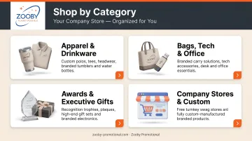
This structure tells a brand story. It also reduces friction — users find what they need faster when categories match their actual context.
Zooby Promotional carries thousands of in-stock products and handles fully custom manufacturing, so a store can combine ready-to-ship branded items with products made to exact specifications — no inventory management required on the client side.
Design the Store for Your Audience First
Who you're designing for shapes every decision — product selection, navigation, access levels, even the checkout experience. Get this wrong, and you'll end up with a store that technically works but nobody uses.
Identify Your Audience Segments Before Finalizing Design
Different user groups have genuinely different needs:
- New hires want clarity, consistency, and a welcoming kit experience
- Remote employees need practical, shippable items — not things that require office pickup
- Field sales reps prioritize portable, professional brand items they can use with clients
- Customers and partners respond to quality and presentation as signals of brand values
Before locking in your product selection or navigation structure, gather insight. Internal surveys, informal feedback from early users, or simply tracking which existing branded items employees actually wear and use — these signals tell you what will actually get ordered versus what will sit idle.
Recognition and Engagement Are Design Outcomes
Audience-first design isn't just about convenience. Gallup research shows that employees who don't feel recognized are about twice as likely to say they'll leave within the year. A company store designed with employee recognition in mind — with tiered access, milestone-specific products, and quality that signals genuine appreciation — becomes a retention tool, not just a merchandise catalog.
Tiered permissions and customized product visibility determine which employees see what — and when. Configured thoughtfully, these features make every user feel like the store was built specifically for them.
Make Navigation, UX, and Fulfillment Work Together
A beautifully branded store that's hard to use — or slow to deliver — damages the brand it was meant to support.
Your Store Lives on Mobile — Design for It First
Forrester's research confirms that 64% of business buyers are Millennials or Gen Z who prefer self-guided digital journeys. That means most of your employees and customers are approaching your store from a phone, not a desktop. Test your storefront on mobile before launch, not after.
Key mobile UX checkpoints:
- Buttons large enough for thumb navigation
- Product images optimized for small screens without losing quality
- Checkout flow that completes in three steps or fewer
- Search that works reliably on mobile input
Navigation Is a Brand Signal
How users move through your store communicates professionalism before they've looked at a single product. Clean, intuitive navigation with category names that match how people think (not how products are classified internally) makes it easier for users to connect with the brand through what they find.
That professionalism breaks down quickly under the wrong structure. Avoid hierarchies that require more than two clicks to reach any product — and skip unclear categories, missing search functionality, or raw alphabetical lists without context. Each of those creates friction that pushes users away before they've found what they came for.
Build Fulfillment Into the Design, Not Onto It
Stores designed without considering fulfillment create brand-damaging experiences: long wait times, inconsistent packaging, and no order visibility. Those aren't operational gaps — they're design decisions that were never made.
Fulfillment decisions to make during the design phase:
- On-demand vs. pre-purchased inventory: on-demand eliminates overhead but requires upfront production time communication
- Shipping options and timelines: users need clear expectations at checkout, not after the order is placed
- Order tracking visibility: confirmation emails and tracking links extend the brand experience beyond the storefront
- Packaging consistency: delivery presentation should mirror the store's visual standards
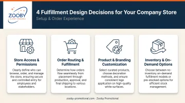
Zooby Promotional's company store model supports on-demand, per-item fulfillment — meaning clients don't need to purchase or hold inventory. But that model works best when expected production times and shipping windows are communicated clearly within the store itself.
Frequently Asked Questions
What are the 7 key elements of brand strategy?
The seven elements are purpose, consistency, emotion, flexibility, employee involvement, loyalty, and competitive awareness. For company store design, they function as a checklist — each one maps to a specific design decision, from product quality standards to how the storefront handles different audience segments.
What are the 4 types of merchandise?
The four types are promotional/marketing items, wearables and apparel, functional/utility products, and premium/gifting items. Each serves a different branding function — promotional items maximize reach, wearables build visibility, utility products earn daily use, and premium items signal genuine appreciation for key recipients.
What is the 3-7-27 rule of branding?
The 3-7-27 rule suggests it takes 3 seconds to make an impression, 7 interactions to build recognition, and 27 exposures to build trust. The core principle — that consistent, repeated brand exposure compounds over time — is why high-quality branded merchandise that gets used daily matters.
How do I choose what products to put in my company store?
Start from your audience's needs and the store's primary purpose. Prioritize quality and relevance over volume, and organize products by use case rather than product type. A smaller catalog of items people actually use will outperform a large selection of forgettable ones .
Do I need design experience to set up a branded company store?
No. Working with a full-service promotional partner handles the technical and operational setup. What you need is clear brand guidelines — logo files, Pantone colors, approved typography — and a defined sense of who the store serves and why.